Here is some analysis on the recent WA 2020 primary, particularly with a focus on the house races.
To get a visual overview, we look at a “Caucus Chart” for the WA House Legislative races for Aug2020. [Data is from WA Secretary of State As of 8/17/2020 -numbers may shift as the ballots are still being counted]. There are 49 districts with 2 house races per district, and all races are up for election every 2 years – so this provides a statewide view. Each vertical column is a race (so 98 in total) and sorted from GOP’s worst race (leftmost) to best race (rightmost). Since this was a primary which allows more than two candidates, all GOP candidates are combined into a single score and all Democrat candidates are combined.

This type of chart provides us a way to see trends across nearly 200 candidates across both parties. We can use that breadth to look for patterns that are not obvious from just a single race. Analyzing this breadth can also help us measure a party’s ambient strength (the baseline benefit that a candidate gets from their party).
Visually, we can merge each of the vertical columns together to get a smoother area chart, as shown below.
- The red area corresponds to the statewide GOP house votes, and the blue area corresponds to the statewide Democrat votes.
- Whoever controls the center has 50% of the seats and controls the caucus. Hence the GOP are trying to push the red area to the up and left, whereas Democrats are pushing to the right and down.
Here is an annotated version with some callouts about interesting parts of the chart.
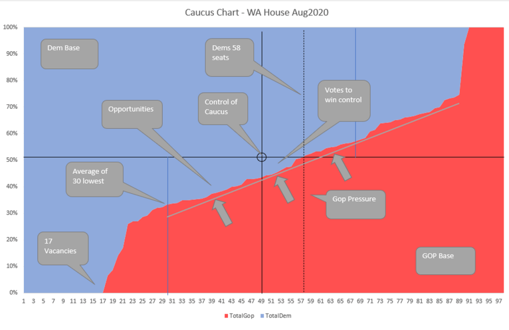
That little blue triangle to the low-right of the center is the votes Gop needs to win to capture the house. In this case, that is about 17000 votes, which is less than 1% of the total votes cast. Flipping the right 1% of total voters would get control of the caucus. The votes come from these races 24.1, 44.1, 30.1, 24.2, 10.1, 44.2, 28.2.
With that chart in mind, we can easily come up with a metric for ambient strength, such as the average of the bottom 30 races.
Here are set of metrics focused on “fundamentals” and how the Democrats and Republicans compared for the Aug 2020 primary:
| Characteristic | Metric | Dem | GOP |
| # of seats won | 55 (56.1%) | 43 (43.8%) | |
| Statewide Total Vote | 56.75% | 43.25% | |
| Pressure | How many vacancies? | 8 | 17 |
| Ambient Strength | Average of your worst 30 seats? | 23.7% | 10.4% |
| Average of worst 10 seats (not including vacancies) | 26.9% | 21.5% | |
| Infighting | Contested primaries where your party is under 50% (avoid infighting in vulnerable districts) | 4 | 7 |
| Discipline | Average % in districts where your party has a primary battle (relegate primary battles to safe districts) | 71% | 56% |
| Enthusiasm | Average turnout when the other party is not on the ballot | 47.3% | 44.2% |
| Depth | # of races won by > 53% | 53 | 39 |
The Democrats are outperforming the GOP in every one of these metrics in the house races.
The statewide voter percent (43.2% GOP) is also interesting to compare to the other GOP statewide candidates in the primary (this is ignoring any 3rd parties and doing a head-to-head compare):
| Position | Dem% | Gop% |
| Insurance Commissioner | 59.13% | 27.17% |
| President2016 | 58.79% | 41.21% |
| Auditor | 58.89% | 41.11% |
| Public Lands | 58.25% | 41.75% |
| House | 56.75% | 43.25% |
| Attorney General | 55.85% | 44.15% |
| Lt Governor | 55.58% | 44.42% |
| Treasurer* | 53.28% | 46.72% |
| Governor | 52.53% | 47.47% |
| SOS* | 45.62% | 51.12% |
(* = GOP incumbent)
