2022 Washington State Legislative Race Predictions

Several weeks prior to the end of the 2022 election cycle, Voter Science produced a set of general election predictions for legislative district candidates.  Using a combination of demographic factors and expected voter turnout, we produced these predictions at the individual candidate level using regression based statistical modeling techniques.  These predictions were shared with a small circle of trusted stakeholders prior to the general election, and we delayed releasing them to a larger audience to avoid an undue influence on legislative contests.

On the afternoon of the general election, we released our predictions to the general public.  Our original predictions can be accessed by clicking here: 2022 Legislative Race Predictions

Post election, we compared our predictions with candidate level performance.  On average, our predictions tended to be highly accurate: the mean prediction error (or MAE) was only 2.5%. Of the 94 races assessed, we were able accurately predict the outcomes of 97% of the time.

The final comparison between our predictions and candidate performance can be found here: 2022 Comparison of Voter Science General Predictions and Actuals

Our ability to accurately predict races ahead of time has several applications including resource allocation across multiple races as well as assessing the viability of different candidates to run for office.  We will cover potential applications of this ability in a future blog post.

Early stats on WA Aug2020 primary

Votes in Washington State’s primary earlier this week are still being counted, but here are some results so far [as of 8/6/2020]. Data here is publicly available from the Secretary of State.

Turnout was around 37%, which is up from 34% in 2016.   

There was a competitive field of GOP candidates running against a 2-term incumbent Democrat. Here were the results of the top vote getters. The top 2 (Inslee and Culp) will go on to the general.

Aug2020_GovResults

Here’s is a further breakdown of GOP candidates per county. Circle size is weighted per county population.

VS_p20recap__gov_R_piePop18_co_804_all

Here’s the combined Democrat (Blue) vs. Combined Republican (Red).

VS_p20recap__gov_RD_piePop18_co_804_all


Measuring a Candidate’s Independence

Who are the most and least “partisan” candidates for WA statewide office?

Often, these sorts of conclusions are argued subjectively in opinion articles based on a candidate’s issue-positions and their endorsements.  However, we wanted to ignore the opinions and go straight to the data to draw the conclusions.  We used only official public data and all results here are repeatable and could be independently confirmed by following the process we detail below.

Continue reading “Measuring a Candidate’s Independence”

How many votes will it take for the GOP to win the 2020 governor’s race in Washington State?

Washington State has been steadily growing, from 3.63 million voters in 2008 to a projected 4.45 million by 2020.   Here’s how the historical trends have looked since 2008, and the projection going forward to 2020. At this rate, it will take 1.76 million votes to win.

Image1

GOP statewide candidates are averaging around 40%-45% in competitive races.

However, traditionally GOP issues have gotten past the 50% mark, notably charters schools and anti-tax measures.

Image2

Comparing Precinct Results across Boundary Changes

While your individual vote is private, the aggregate vote of from your precinct (ie, neighborhood) is public. Campaigns often look at these precincts level results to answer questions like “How did the President do in my district?” and “How did this Initiative correlate with that candidate?”.

Merging precinct results from different races together to get these insights can be valuable – but only if the merge is done correctly! But what happens when you need to merge precinct results across different years and the precinct boundaries have changed? This is particularly significant when comparing precinct results from 2010 (before redistricting).

Here are several examples of precinct changes, going from an old (dotted blue line) to a new (solid red line) boundary.

BoundaryChanges

  • Rename – The precinct gets renamed from “A” to “X”, but covers the same area.
  • Split – The precinct gets split into 2 smaller precincts. “A” gets split into “X” and “Y”
  • Merge – Two smaller precincts get merged into a larger precinct. “A” and “B” get merged into “X”
  • Combination – a combination of the above, representing a potentially arbitrarily complex transformation.

Your precinct may even have kept the same name but still significantly changed boundaries! A precinct from 2010 and another from 2018 could have the same name, but refer to totally different voters or neighborhoods.

So naively, if you just measure results from old and new precincts, you could get a complete mixup.

Measure it!

We measured how much WA state 2018 precincts had changed since 2018 (before redistricting). We call this the “decay rate” (see VRDB decay rate).

Each point on the chart below represents how “intact” a 2010 precinct is compared to the same precinct name in 2018. Precincts that are 100% intact are stable and haven’t changed – those results can be merged safely by name. This chart shows the portion of precincts that stayed the same vs. changed.

PrecinctDecay2010-2018

In fact, it turns out over a third of the precincts were totally intact from 2010. But half were completely different! Merging precincts from that half could give completely random results. What’s interesting is how clustered the results were: over 80% of precincts are either nearly unchanged or completely changed. So this is a highly localized phenomena: some areas may not see it at all (and hence not even realize it exists), whereas other areas may be heavily impacted.

What can we do?

The good news is that once we recognize this, we can actually do geo spatial comparisons to map the old precincts into the new ones. This creates a transform that lets us compare precinct results across different boundaries.

Is Washington State Gerrymandered?

“Gerrymandering” is manipulating political boundaries to favor a party. Wikipedia has an excellent summary and examples of the concept:

How to Steal an Election - Gerrymandering

We’ll take a purely data-driven approach to measure if Washington State’s legislative districts are gerrymandered. While there is no absolute mathematical definition for gerrymandering – and therefore no definitive test – there are good objective statistical tests to measure anomalies.

This article focuses on applying these approaches to the legislative boundaries in WA state.

  1. First, we’ll look at the actual election results and see if there’s anything suspicious on the surface.
  2. Then we’ll run a standard statistical test – the McGhee test developed at the University of Chicago.
  3. And then we’ll run some generic algorithms to produce actually gerrymandered maps and compare to actual results.

To simplify nomenclature throughout this analysis, we’ll provide summary from the GOP perspective. The results can all be directly flipped to switch to the Democrat perspective. (IE, almost always, a x% GOP result means a (100-x)% Democrat result).

To simplify nomenclature, we’ll look at results from the GOP There’s no definitive criteria for creating district boundaries. Districts must be contiguous and similar in population. However, even these criteria are tricky. For example, a district boundary is set for 10 years, so as population grows and shifts over time, districts’ populations may shift. Districts can’t be simple shapes like hexagons because they may need to account for geographic boundaries or roads.

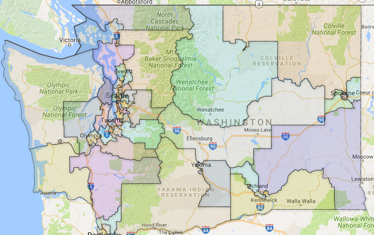
Here is a map of legislative boundaries. Since districts are population based (and not based on square-miles), one can see the districts are more concentrated in dense population centers.

WA Leg Districts 2016

[1] Looking at actual election results

WA has 49 legislative districts, and each district has 2 house members and 1 senate member.

As of the last statewide legislative election in Nov ‘16, in the senate, the GOP / Democrat split was 24-25. In the house, the GOP/ Democrats split was 48- 50. Roughly 90% of the 49 districts have all three members from the same party, indicating that individual districts carry a definitive partisan bias. But when tallying up all the legislative races, the overall split is almost evenly divided between parties in both the house and senate caucus.

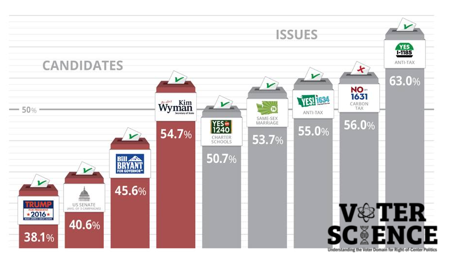
Here’s how the GOP results in the legislative caucuses compares to their 2016 statewide results between a Democrat and Republican candidate. [ Source: WA Secretary of State] :

GOP Candidate Percent Vote
2016 Secretary of State (Wyman) 54.74%
2016 GOP House 48.98%
2016 GOP Senate 48.98%
2012, Governor (McKenna) 48.50%
2016 Auditor (Miloscia) 47.69%
2016 Public Lands (McLaughlin) 46.84%
2016 Governor (Bryant) 45.61%
2016 Lt. Governor (McClendon) 45.61%
2016 Insurance Commissioner (Schrock) 41.66%
2016 Senate (Vance) 40.99%
2016 President (Trump) 38.07%

So clearly the Republicans have done a better job in the legislature than at most statewide races. Only Kim Wyman has outperformed the caucuses.

Some may suggest gerrymandering as the only way that the Republican caucuses could outperform statewide races. But a statewide race requires a single candidate to appeal to all 49 districts. Whereas legislative districts have a different candidate per district, allowing each candidate to vary to “fit the district”.

The real test of boundaries is to focus on a single partisan candidate and compare what percent of legislative districts they’d “win” to their statewide percentage.  For example, Trump got 38.07% of the statewide vote. He also won 19 / 49 legislative districts, which is 38.78% – nearly the same ratio that he had statewide. That is a strong indicator that the districts aren’t gerrymandered.

We can see the results from other partisan statewide candidates:

GOP Candidate % of Statewide vote % of Districts won
2016 Secretary of State (Wyman) 54.74% 78%
2016 Auditor (Miloscia) 47.69% 53%
2016 Public Lands (McLaughlin) 46.84% 47%
2016 Governor (Bryant) 45.61% 47%
2016 Lt. Governor (McClendon) 45.61% 45%
2016 President (Trump) 38.07% 39%
2016 Insurance Commissioner (Schrock) 41.66% 33%
2016 Senate (Vance) 40.99% 27%

This analysis is looking at a broad range of races across a 15% spread. If the districts were actually gerrymandered, we’d expect that GOP candidates consistently performed better (or from the Democrat’s perspective, worse) in ‘% of district won’ than by ‘% of statewide vote’. But they do not. There’s an almost linear correlation between these results (R2=.83). Candidates that won more statewide votes also won more individual districts. Some GOP candidates benefit from the legislative boundaries, some performed worse.

[2] Bring out the math – running the statistical tests

The mathematical test we’ll run is the McGhee test, developed by Eric McGhee from University of Chicago. “Wired” explains “In that paper, they proposed a simple measure of partisan symmetry, called the “efficiency gap,” which tries to capture just what it is that gerrymandering does. At its core, gerrymandering is about wasting your opponent’s votes: packing them where they aren’t needed and spreading them where they can’t win.”

The test defines a “wasted vote” as any vote that does not directly contribute to a victory. If you win a district, any vote past 50% is considered wasted (it wasn’t necessary to win); if you lose a district, all of the votes were wasted. Practically, this means:

  • Unless you win a district with exactly 50%+ 1 votes, there are at least some “wasted” votes.
  • large blowout victories and 49.9% “close calls” produce the most “wasted” votes.

It then defines an “efficiency gap” as the (difference in each party’s wasted vote divided by the total vote). There is no definitive threshold for the efficiency gap that defines gerrymandering, but McGhee calculated the average efficiency gap in 2012 was 6%, and the egregious gerrymandering examples have are over 10%.
We apply the McGhee test on the 2016 presidential race across the legislative districts using election data from the Secretary of State:

GOP Candidate Percent Vote Egap
2016 Secretary of State (Wyman) 54.74% -16.3%
2016 Auditor (Miloscia) 47.69% -6.3%
2016 Public Lands (McLaughlin) 46.84% -2.1%
2016 Lt. Governor (McClendon) 45.61% -2.2%
2016 Governor (Bryant) 45.61% -4.5%
2016 Insurance Commissioner (Schrock) 41.66% 2.6%
2016 Senate (Vance) 40.99% 6.8%
2016 President (Trump) 38.07% -3.7%

The average gap from this spectrum of WA races is 3.2%, well below the national average. So our statistical test suggest that the districts are not gerrymandered.

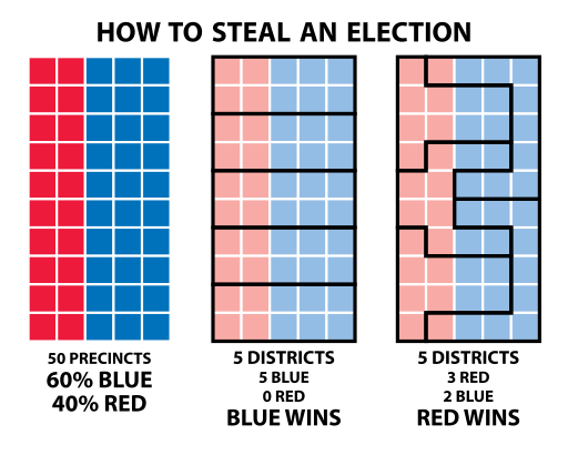
[3] What would gerrymandering look like?

A final approach we take is to work backwards: we can deliberately produce gerrymandered maps and compare them to the actual map.
Here, we use a genetic algorithm, which starts with an initial configuration and then mutates it over a series of iterations as it “evolves” towards a goal. Mutations must preserve certain rules like contiguous boundaries. In this case, the goal was to maximize the number of GOP legislative victories, where victories where calculated using a Monte Carlo simulation driven by previous election turnout results from record poor GOP years. We used election results that initially gave GOP only 21 of the 49 districts – simulating a “worst case scenario” for GOP that put them near their historical lows. After series of genetic mutations, the final result was a map with 26 of 49 GOP wins – a pickup of 5 seats. The chart here shows the evolution progressing along the top.

Generic Algorithms Gerrymandering

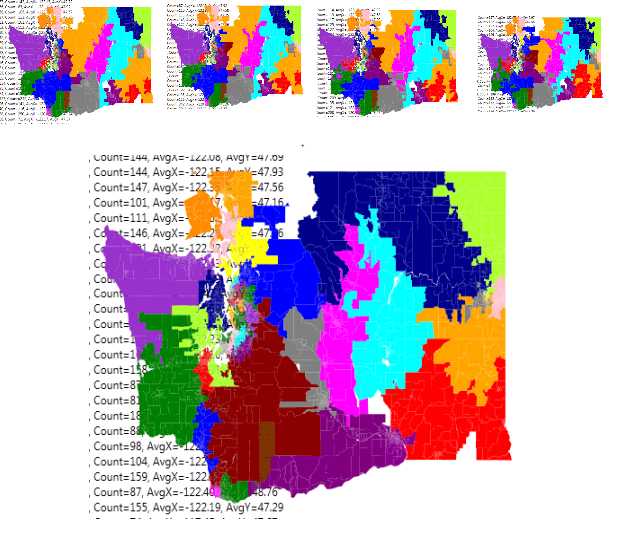
However, we notice that the boundaries here definitely look suspicious. They’re clearly warped and have unnatural borders designed to carve out an advantage.
What this also shows is that truly gerrymandered results could produce a significant GOP advantage – even in a year with record poor Republican voter turnout.

In conclusion

To summarize:

  1. The legislative results are within proximity of the statewide governor results. And when measured across a wide range of candidates, there is no consistent advantage from district boundaries over a pure statewide vote.
  2. The house and senate GOP caucus performances do perform exceptionally well – particularly compared to the statewide performance of most GOP candidates. But this appears to be more due to the caucuses picking candidates to fit their district rather than gerrymandering.
  3. If we deliberately create theoretical gerrymandered districts via computer simulation, the potential GOP advantage would be significantly higher than what we witness.

In the absence of any contradicting evidence, we would conclude that WA state’s legislative boundaries are fairly drawn and not gerrymandered.

LD 45 Turnout Statistics

The special election for the 45th district senate seat is Nov 7th 2017, just a few days away. Here are some statistics based on the ballot returns reported by the Secretary of State.

 The district is about 92,000 voters. Overall turnout as of Nov 4th is 21.3%. This is the highest turnout for an election district over 30,000 voters.

King County turnout  overall is 15.4%.  For comparison to other off-year legislative elections, Teri Hickel’s ’15 special election was 35%.


There has been significant new voter registration in the district since Andy Hill’s ’14 election victory. Here is a breakdown registration date:

% of district … registered since…
2% Since ’17 Primary
6% Within last year
21% Since Nov ’14

It’s a predominantly Democrat district.  In ‘14 and ’16 house races, Democrat’s average victory in LD 45 has been around 58%.  The district also voted over a 2:1 for Hillary Clinton over Donald Trump. Kim Wyman and Andy Hill are the only Republicans to have won this district.

The SOS does not report on the actual ballot results until election night, but we can use the Voter-Science party id database [1] to see how results are looking prior to election day.

 Here is a heat map of Democrat turnout (left) vs. GOP turnout (right) in the 45th :

LD45Tunrout-Nov4th2017

Of Voters identified as GOP, 28% have voted. Of voters identified as Democrats, 23% have voted.  Of voters identified as Independents, only 14% have voted.  So while the democrats may have raw volume of numbers, the GOP has driven higher turnout amongst their base.  

 [1] The Voter-Science party ID database has a party ID for 87% of the individuals in the 45th district and has accurately predicted all 45th races within 98.5% accuracy since 2015.

Measuring the Trump Effect (Updated 11/15)

One of the most contentious elections in U.S. history is over and Donald J. Trump will be our next president.    Although Trump’s victory was moderately large in terms of the electoral vote, the closeness of the popular vote will prompt questions for Republicans moving forward, particularly in “blue” states such as Washington.  Just how did Trump do with Independent and soft Democrat voters in Washington state with whom Trump, though a polarizing figure, polled somewhat well since the early this year?


The question we wanted to answer was, “What exactly was the impact of Trump on Washington state races?”


Voter Science undertook a statistical modeling analysis of the early return data to assess Trump’s effect on local and statewide races.  We used data from ballot returns through Nov. 11th (with the understanding that final certified results will not be available for another several days).  Our statistical modeling utilized regression modeling using the form:

equation

Legislative district race results were modeled using Trump/Pence performance and other factors as predictors.  Performance deltas to Romney/Ryan 2012 were factored in to determine the detriment or improvement a legislative candidate received this cycle, what we’re calling the Trump Effect.


In general, we found that the Trump Effect amplified pre-existing voter preferences, giving Republican candidates a lift in predominantly “red” areas while dragging them down in places that would otherwise have been more likely to be closely contested.

Trump’s Impact on State Legislative Races: Tailwind or Drag?

For state legislative candidates, the Trump Effect depended largely on where you were.

The Trump Effect produced a “Trump Tailwind” for Republican legislative candidates in primarily Eastern and Southwest Washington.  The effect was particularly strong in Southwest Washington counties; Republican legislative candidates there received an average 5 to 6-point lift.

However, the Trump Effect was a net negative – “Trump Drag” – in many of Washington’s most populous counties, primarily those touching Interstate 5.  The Trump Drag was most evident in King County where the effect of the presidential ticket was to subtract an average of 5.2% from Republican legislative candidates.

Table 1: Net Impact of Trump Effect on Legislative Races (select counties updated 11/15)

updatedlegresults20161115


Figure 1: Net Impact of Trump Effect on Legislative Races by County

map_impact

The impact on legislative races was stark in some cases:

Table 2: Trump Effect Impact Select Races 

As of 11/10/16, Republicans running in King County have racked up four losses.  Even in the deeply red 5th Legislative District, there was a point at which all three seats were at risk, and although the two state House positions are currently leaning R in terms of returns, and the state Senate race is currently a loss but trending toward a possible late Republican win, our modeling predicted the margin should have been decisive at this point where it not for Trump Drag.

The 30th LD, where the Republican party worked so hard in 2015, has seen two star incumbents removed.  State Senator Steve Litzow in the 41st ran to a tie in the primary but lost by more than five points in the general.  Again, our predictive modeling indicated that Litzow should won handily; Trump Drag pulled roughly 3,800 votes from the R column in that race.

Statewide Races

Statewide Republican candidates suffered because of Trump Drag.  Overall losses to statewide candidates ran between 2 to 3 points and effectively made the races for Lands Commissioner and Auditor uncompetitive.  Were it not for the Trump Effect, both races would have been within 1 percentage points.

Table 3: Trump Effect Impact on Statewide Candidates

table_statewideraces

Depending on the race, the Trump Effect sliced off 50,000 to 70,000 votes from each of our key races.  Only Kim Wyman, the incumbent Secretary of State, fared better than the remaining slate of Republican candidates.

As with state legislative races, statewide candidates took the biggest hit in King County, a particularly rough Trump Effect because the county accounted for approximately two-thirds of the lost votes across all candidates.

Figure 2: Trump/Pence Performance as of Nov 12th

map_trump_results


Conclusions

Although many Republicans are celebrating Trump’s presidential victory, it is important to recognize this Trump Effect and what it says about the electorate here in Washington state.  A deep divide persists among Washingtonians that represents a major challenge moving forward.  How do Republicans reconnect with Independent and more conservative Democrats who have at times walked across party lines to vote for Republican candidates.  There is fertile opportunity to engage with these voters outside of the traditional social justice spectrum.  The final part of our challenge is identifying the hot button issues that these voters care about that have alignment with conservative values.