For those who didn’t see the demo at Roanoke 2023 or have enrolled as beta testers, it’s my pleasure to introduce you to the v2.0 release of Voter Science Canvasser on Android and iOS. The three major new features included in this release are:
- New dashboard panel
- New route detail panel
- Optimal route generation
Most of these new features have been suggested by users in the field, and I want to thank everyone for providing that valuable feedback during the 2022 campaign season. As a candidate I was also testing the designs first hand, a tradition that at Microsoft we referred to as “eating our own dogfood.”
New Dashboard Panel
Probably the most obvious change that you’ll notice on first launch of the 2.0 release is the new DASH tab on the main screen. This will be familiar if you’ve used VS Fundraiser, and it’s basically loaded with statistics and history for the selected walking list.

Like Fundraiser, the dashboard consists of two animated donut charts that summarize the status of households in the current sheet (To Do, Voted, Complete, etc.) and the result of contact for each that have been visited (Left Literature, Talked with Voter, etc.). The History section contains a list of all the doorbelling sessions for the sheet, broken down by date and by canvasser email. In the detail line for each history entry, you’ll see the number of households canvassed during that session, the total number of voters represented by those households, and the total distance covered.
Tapping any of the history entries will show the new route detail panel:
Route Detail Panel

This detail panel roughly shows the path taken canvassing during that session. Since we’re just connecting the positions that were logged in the history by GPS position and timestamp, it’s not necessarily your actual walking path but an approximation. That said, it can quickly identify volunteers who may have tried to canvass their walking list from the local Starbucks. Note that the pins on this path currently represent voters visited, and not households, since that’s how changes are logged. A future update may consolidate those back into households so that you can tap them to navigate to the household detail panel.
Optimal Route Generation
You will notice a new option in Settings > Lists> Sort By:

By selecting the new Route option, Canvasser will generate an optimal route for you to take to canvass the walking list. Creating optimal routes is a generalization of the Travelling Salesman Problem (TSP), which belongs to the class of NP-complete problems. Thus, it is possible that the worst-case running time for any algorithm for the TSP increases superpolynomially (but no more than exponentially) with the number of potential stops, making it impractical to simply brute force. The algorithm that I’ve chosen is a classic pairwise exchange or “2-opt” technique constrained by paths segmented by block and side of the street (thus preventing zig-zag patterns as you progress down the street). This ends up being a decent optimization for canvassing, given that we currently can’t easily constrain to actual street geography.
Here’s an example shown on the Hybrid map type:
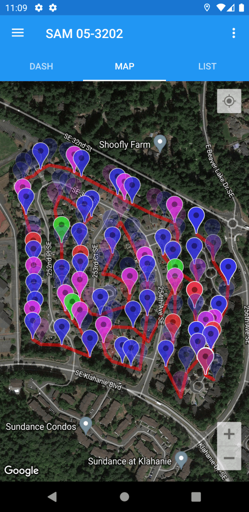
The optimal route is shown with red traces, just like the historical routes shown in the new route detail panel. The List tab is also sorted in the optimal route order, allowing you to just swipe through household detail view to progress through the walking list.
Getting Started
The v2.0 release of VS Canvasser represents a major feature release for the 2023 campaign season, and it is now live on both the Google Play Store and Apple App Stores.


We remain committed to further tactical improvements as the election cycle progresses. If you have any additional feature requests, please send them to chad@voter-science.com and I’ll make every effort to roll them into a future release.